A journey of transformation, planning, and modernising
Every great journey begins with a single step into the unknown. You have the destination in mind, but before you start, you must plan the route, pack the essentials, and try to prepare for all the what ifs. That’s precisely what rebranding has been for us at Sterling—a journey of transformation, planning, and modernising.
Along the way, we had to navigate challenges, explore new creative landscapes, and rediscover the essence of our brand to make the journey as smooth as possible. This rebranding is more than just a cosmetic update—it’s a transformative voyage that shapes the future of our company.
Reasons for the expedition: Why Rebrand? Why Now?
Over the past few years, we’ve expanded our and knowledge. As we explored uncharted territories, we realised that our brand identity needs to evolve alongside us. It should reflect the modern, structured, and dynamic organisation we’ve become while staying true to the core values that have guided us for the past two decades.
But growth isn’t just about reaching new destinations; it’s about preparation and the right tools to navigate the road ahead. As we scaled new heights, we saw the need for a more potent, cohesive communication strategy to lay the foundation for the future of our partnerships.
This rebrand is the first in Sterling’s almost 20-year history, making it a landmark moment in our journey. It has been a process of careful discovery, building on what worked, discarding what didn’t, and continuously refining our direction.
Wojciech Kubica, Marketing Manager
Now, as we unveil Sterling’s new identity—identity that represents us today and sets the foundation for tomorrow—we do so with confidence, ready to navigate the future with clarity and purpose.

Planning the route: research, research, research
Much like an expedition, successful rebranding demands careful preparation, a bold vision, and the agility to adapt along the way. To this end, we sought expertise from other specialists.
Premium Consulting’s materials helped us craft a messaging strategy that remains clear, confident, and aligned with our business goals.
Forma, Kolor, Typografia, a book by Krzysztof Piła, along with resources from Fuse Collective and Fluo Studio, played an important role in helping us shape our visual identity and refine our brand’s essence.
Our marketing team has spent dozens of hours refining our approach, in addition to multiple surveys and interviews with employees and clients alike.
We’ve attended communication strategy workshops, sales funnel development sessions, and spent countless hours analysing content, documents, and websites. We’ve also had in-depth conversations with management and directors, ensuring that every step forward was guided by research and strategy.
Wojciech Kubica, Marketing Manager

Gathering the equipment: brand pillars, content structure & key visuals
Defining Our Brand Pillars
Analysing both internal and external feedback, alongside a deep dive into existing content, was a crucial step in defining our brand pillars—a process that spanned over several months. We gathered insights from employees to understand the brand’s core values and unique strengths. Externally, customer feedback and market research helped us align these strengths with audience expectations. By meticulously evaluating survey responses and content, we identified the industry needs and how we can fulfil them.
As the Missing Piece, we seamlessly integrate into our clients work style and systems, providing high-quality services that remain invisible from the outside—ensuring their safety and a positive experience. While you focus on growth, we deliver the reliable support that keeps your operations running smoothly.
Read more about our SPARK, mission, and values here!
Structuring Our Story
Our LinkedIn account, under the name “Sterling,” will be dedicated to business news, case studies, and showcasing the growth of our employees. Meanwhile, Facebook and Instagram will focus on people-centric content, highlighting events, career stories, recruitment tips, and job opportunities.
Sterling’s websites have undergone their most significant revamp yet. The Credit Control and general Outsourcing pages have been combined to create a more seamless experience.
Transforming our websites has been an incredible experience. Although the process was tedious and required meticulous care, the results made it all worthwhile. We focused on creating clear, transparent content structure, while ensuring a seamless and user-friendly experience.
Aleksandra Zięba, Junior Brand & Content Specialist
The Role of Key Visuals
As a result of never-ending brainstorming, we decided to polish and shorten our brand’s name and go simply by Sterling. This change reflects our commitment to excellence and bold, unified vision for the future. With that came the need to upgrade our visual identity. We designed a new logo, updated our colour palette, and evolved our communication strategy to better reflect who we are and how we support our clients.

Our new logo, composed of four shapes forming a larger structure, symbolises unity and collaboration. The bottom-left square represents Sterling—the foundation, the Missing Piece that seamlessly connects with organisations (and their departments), supporting and strengthening their businesses. While seamlessly aligning with their culture and systems, it forms a sterling quality – a star shape.
The purpose wasn’t just to create something visually appealing but to capture everything the Sterling’sbrand stands for. Every detail was carefully considered to ensure that the new identity truly reflects our beliefs and mission.
Magdalena Bąk, Junior Content & Visual Specialist

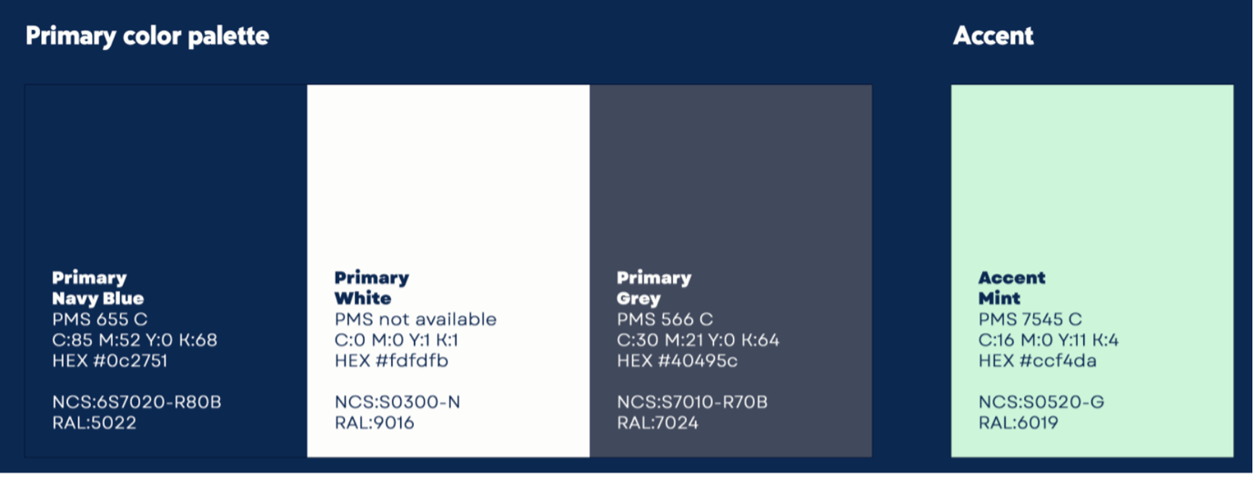
Main colours of new colour palette are navy blue, white, grey, and a hint of mint. It’s a fresh, modern accent that adds just the right contrast, making Sterling stand out and pop! Navy blue, on the other hand, conveys stability and reliability that, through the years, became synonymous with Sterling’s culture.
Magdalena Bąk, Junior Content & Visual Specialist
Preparing for the unexpected
We invite you to embark on this journey with us as we approach the official launch. We’re happy to share with you Sterling’s next chapter. This is a truly extensive undertaking—and one that’s far from over!
Stay tuned, stay inspired, and get ready to experience the upgraded Sterling. Growth isn’t just about where you go—it’s about how you get there, and together, we’re on the right path.


